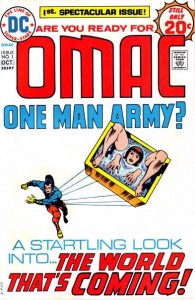
In 1974 legendary comics auteur Jack Kirby was falling out of favor with DC’s editorial staff thanks to his far-ranging yet low-selling Fourth World saga.
Deposed from the universe he wanted to cultivate, Kirby created a new and more cynical hero inhabiting our near future. His name? One-Man Army Corps, or OMAC. OMAC was a man, a symbol, and later a cyborg who policed a world living in enforced pacifism, inheriting his powers (and commands) from an Orwellian all-seeing satellite named Brother Eye. He spends his debut rescuing a damsel in distress who turns out to be both an android and a bomb.
Sound weirdly dystopian enough for you?
DC has brought back OMAC for a few different rounds of encores over the years, but it was still a surprise to see the book on the slate of 52 for this month. Would it bring newly imagined? Kirby-eseque delights? And, if it did, would they be worth reading in the modern day?

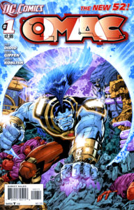
O.M.A.C. #1
Written by Dan DiDio & Keith Giffen, art by Keith Giffen & Scott Koblish
Rating: 1 of 5 – Bad
In a Line: “Probably in there organizing toilet paper … or something.”
140char Review: OMAC #1’s inconsistent artwork ruins a simple story that could’ve packed a bit of punch. Like a bad free comic in a box of stale 90’s cereal.
Plot & Script
The DiDio/Giffen is plain and easy to read. It reminds me of the comics I’d read as a kid.
I suppose DiDio is an old-school writer in that way. His dialog is plain and declarative, and he’s not above using the occasional narration box to advise on the action (which is great, since the action is so incomprehensible).
Nods to existing continuity will tickle if you know your DC Kirby history, as everything we meet in the underground Cadmus lab is a love letter to older readers. However, if you aren’t ready for the barrage of old-time Easter eggs OMAC’s series of obstacles will surely fall flat.
The problem is that this fails as a compelling debut. We see OMAC clear a number of obstacles, but don’t really get to understand what his powers are. He doesn’t have a character when in OMAC form, so really the only personality we get is the obstinate commands of Brother Eye.
For a book that could easily be something you’d hand to a kid brother, I don’t understand why the scrip makes a point of having a the female lead say “ass” twice. Oh, and the issue’s title (“Office Management Amidst Chaos”) is kinda dumb.
Artwork
Art team Giffen and Koblish don’t have a gift for figures or for action, which leaves little to enjoy in this issue of terrible artwork.
Okay, maybe that’s not entirely fair. More accurately, Giffen’s wide, plaintive faces seem to be a deliberate homage to OMAC-creator Kirby, but the modern gradient coloring renders them a too-busy mess. His bodies are a mess of mismatched limbs, perspectives, and proportions that make no sense. He seems to have a specific problem with placing a limb that’s partially obscured by someone’s torso that seems to indicate a failure in the fundamentals of anatomy.
Oh, and all of his men look like they are wearing MC Hammer pants.
There’s no helping Giffen’s incomprehensible action, which unfurls like freeze-frames from a low-budget video game. Movement simply doesn’t track from panel to panel. OMAC seems to have the ability to materialize projectiles from thin air, similarly vanishing their debris afterward. Punches from OMAC might to have the power to dissolve entire bodies beneath them, which is the only explanation for the totally whacked perspective in those panels.
And OMAC himself? Does his hair omit electricity? He looks silly to begin with, and the inconsistent scale of his limbs to the trunk of his body just makes things worse. Is he squat with long-reaching arms, or limber with lean muscular legs? Are his fists really bigger than his head? Apparently, all of the above. Maybe he’s a shape-shifter. You would never know the different from the artwork in this book.
From a graphic design perspective, this is one of my favorite logos of the relaunch. I love the layering of the letters.

OMAC’s 1974 debut, scripted and drawn by Jack Kirby.
CK Says: Skip it!
O.M.A.C. is an embarrassing failure on all fronts, a condition only amplified by the fact that writer Dan DiDio is DC Comics’ co-publisher.
The issue is not even exciting enough to warrant calling it a fun comic for kids – nevermind the two gratuitous uses of the word “ass” making it inappropriate. A flat, barely-existent script could have been a fun bash with a flashy penciler, but the Kirby-imitating, wildly-inconsistent art places this issue just a step above a comic you’d get for free in your cereal box.
Let’s hope this is the worst book of all 52 re-launched by DC, because I’m not sure how much farther downhill a marquee debut comic can go from here.