Superman has been dangled like a carrot over readers’ noses all through DC’s 52 debut month, from his hot-headed flashback appearances in Justice League and Action Comics to his benevolent present day cameos in Swamp Thing and Supergirl.
The promise was implicit: you’ll get your full dose of Superman in the title with his name on it. Not only that, but that his modern depiction would help to contextualize the superheroes that appeared throughout all 52 books.
Well, we’ve arrived. 51 books later and it’s time to unveil the boy in blue in the present tense – in the capable hands of comics veteran George Perez.

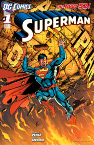
Superman #1
Script & breakdowns George Perez, pencils & inks by Jesus Merino
Rating: 2 of 5 – Uneven
In a Line: “Superman, however, was occupied with other matters.”
#140char Review: Superman #1 is all the reasons modern readers mock 80s comics. Perez way overdoes it on script in this tangled one-shot plot.
CK Says: Skip it
Superman #1 under-delivers, focusing on every possible detail except for Superman. Classic creator George Perez over-scripts this allegory about print media living past the digital wrecking ball. Despite keeping this plot confined to a one-shot and fitting in a super-brawl, this issue was a chore to read.
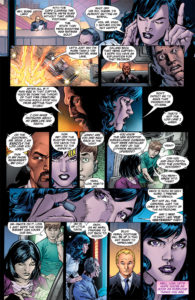
This issue is too obsessed with text. Do we really need to know all the ins and outs of the Daily Planet’s newfound home in a major media empire? Perez chooses to defray his heavy-handed narrative voice-over by assigning it to in-story speakers, but it just makes things worse.
From the mayor’s overbearing introductory speech to a nonsensical newspaper article that reads like a bad blog post fraught with grammatical errors, Perez presents an unfortunate example of why modern comic readers tend to mock the overly-narrated issues of the 70s and early 80s.
 If there is one aspect of the issue safe from criticism, it’s the artwork. Perez’s breakdowns guide artist Jesus Merino to fine issue of art – where’s it’s not obscured by text balloons, that is. A Courtney Cox inspired Lois winds up the star of the issue, and like Cox she’s an ageless blend of leggy starlet and purring cougar.
A one page diversion that sets up Stormwatch makes no more sense here than it would in any other title, except this is the ostensible present-day super-flagship. It’s still awkward.
In a graphic design nitpick, center-aligned narration boxes that contain entire paragraphs are a bad move. Readers don’t want to drag their eyes down a ragged left margin of text in a box. It’s confusing.
Superman #1 is a disappointing delivery given the buildup we’ve seen all month. While I’d welcome a series of one-shot stories showing the Man of Steel in action, I don’t think Perez’s narrative style jibes with Metropolis – especially when the ultra-efficient Grant Morrison is the other scripter in town.
I was waiting for this book for months up until when I read it which took me say a week to read. Why? Because when all there was was tons and tons of reading zzzzzzz. Please please please take it from Morrison and Rags keep the art spectacular and the reading easy plus action packed. That’s the winning combo to a great book,not when it takes a week to read it..Id give it a A but the reading killed my intrust to a B-
Didn’t have a problem with the text so much as the complete disregard for focusing on the main character! Still confused how Perez could get away with writing Superman #1 and not even explain who this character is in light of the new DC universe. Instead he wrote a thesis on modern media with sprinkles of Rupert Murdoch’s cautionary tale of unethical journalism; all of which has been said before and better.