Welcome to another week of Back Issue Review! In this post, I share my capsule reviews of comic books I read that were not newly-released this month.
My reading this week was entirely focused on non Big Two comics (that means no Marvel and no DC) and largely on checking out books with women protagonists I hadn’t read before.
This post includes reviews of:
- Black Cloud (2017) #1-2
- Black-Eyed Kids (2016) #1-15
- Bonehead (2018) #1
- Dread Gods (2017) #1-2
- God Complex: Dogma (2017) #1-3
- Interceptor (2016) #1-5
- Justice League (2016) #22-24
- Lady Mechankia (2010) #0-2
- Maxwell’s Demons (2017) #1
- Morea (2017) Vol. 1
- Paper Girls (2015) #11-15
(AKA Volume 3) - Reactor (2018) #1
- The Realm (2017) #1-4
- Rose (2017) #1-4
- Tarot: Witch of the Black Rose (2000) #1
- Void Trip (2017) #1-2
- Warframe (2017) #1
Unfortunately, most of those weren’t very good, but I did come away with a pair of new favorite titles, plus one I enjoyed but couldn’t commit to because we’re from such different worlds.
![]()
Black Cloud (2017) #1-2, Image Comics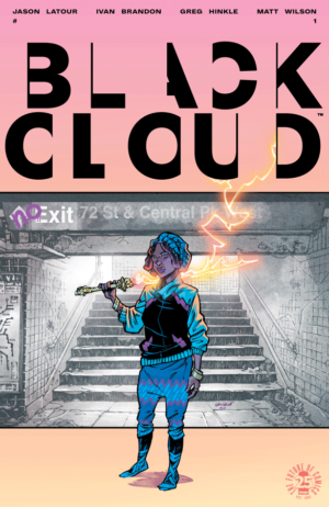
![]() Black Cloud has a concept that’s a little bit larger than its ability to execute said concept.
Black Cloud has a concept that’s a little bit larger than its ability to execute said concept.
A young woman is a part of two worlds, the one we know and a dreamlike world that she can grant access to as if she’s delivering a dose of hallucinogens. She’s hired by a political candidate to keep his screw-up son off the grid, but she loses tack of him in the midst of her ongoing personal conflicts with the powerful figures in her dreamworld.
That sounds awesome, right? That’s why it’s such a bummer that this book isn’t good.
The plot is deliberately obtuse. It leaps back and forth from the two worlds without really giving us enough information about our place in either one of them. It’s one thing to keep a reader a bit unbalanced in early issues, but I felt like I wasn’t only left without the ability to understand, but without a reason to care.
It’s also hard to read. The lettering is too blocky, the bold is too bold, the kern needs fixing when different font weights are used in the same balloon. If you’re going to have a comic with an inventive, confusing, potentially off-putting plot, you cannot combine that with making it unreadable.
When a comic is a bit of a mess and actively fighting against your ability to read it, the incentive to try to hang on for something good approaches zero.![]()
Black-Eyed Kids (2016) #1-15, Aftershock Comics
Volume 1 (#1-5)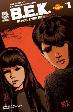
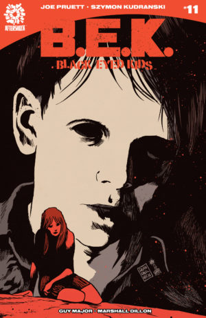
![]() Black-Eyed Kids is a suspenseful page-turner. It’s a horror comic that doesn’t rely on bloodiness to sell its scares (though there’s quite a bit of it here). Kids across a small town are mysteriously going all dark in the eyes and becoming murderous. It’s like a X-Files episode with no Mulder and Scully to save a town doomed to be consumed by long-gestating evil.
Black-Eyed Kids is a suspenseful page-turner. It’s a horror comic that doesn’t rely on bloodiness to sell its scares (though there’s quite a bit of it here). Kids across a small town are mysteriously going all dark in the eyes and becoming murderous. It’s like a X-Files episode with no Mulder and Scully to save a town doomed to be consumed by long-gestating evil.
The art in Black-Eyed Kids is tremendous. Gorgeously rendered and lifelike linework from Szymon Kudranski is accompanied by with rich, dark colors from Guy Major. As a whole, it often looks like a more polished version of Andrea Sorrentino, but without his penchant shattered layouts.
When you have an interior artist this good, I have to wonder about the utility of sketchier artist like Francesco Francavilla on covers. Sure, he’s a big, known name, but the vintage horror movie vibe of the covers do nothing to sell the sumptuous art on the interior!
The brisk pace dips slightly in the middle for some exposition, though nothing entirely explains the sudden presence of these children. All we know is that once a child begins to turn tall of their living immediate relatives must die so that they can complete their transformation into a vessel of evil.
The story focuses on a newly-turned kid, Michael, as he hunts his estranged father and tries to finish off his sister after an unsuccessful attack in the opening pages. Meanwhile, the main hive of BEKs plots their world domination and kidnap a successful writer, ostensibly for her to chronicle their takeover of the world but really for some other secret reason.
The action accelerates for a breathtaking end that left me immediately hungry for more!
Volume 2 (#6-10)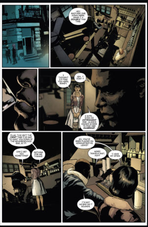
![]() Somehow this suspenseful horror comic got even better with a second volume.
Somehow this suspenseful horror comic got even better with a second volume.
All three of the parallel plots advance in unexpected ways, alternating in releasing a steady drip of information to keep us while leaving a lot to mystery. As our characters are pulled together in their struggled against the Black-Eyed Kids, a mysterious stranger drops into the middle of the struggle. He brings knowledge of how to defeat the BEKs, a tragic connection to them, and an unexpected link to the mysterious writer that the BEKs obsess over.
Meanwhile, Michael still wants to kill his family, but with his transformation stuck in a middle state he finds himself subtly working against the other BEKs.
The line art from Szymon Kudranski and colors from Guy Major continue to be completely off-the-charts spectacular. We get one of our first scenes played in full light here, and the flesh tones are beautiful, especially as they contrast with the book creeping back to its palette of heavy, inky blacks at the end of the sequence.
This arc ends by pushing our suspension of disbelief to the limit with a coincidental confrontation and a big bloodbath. It seems to exist mostly to tease a revelation about Meredith the writer that is never delivered, which leaves us with a massive cliffhanger for the next volume.
Volume 3 (#11-15)
![]() The third arc of Black-Eyed Kids has an odd quality to it, as if it’s stretching out a small amount of plot across the issues leading up to the end of its “Season 1” even with no future return assured.
The third arc of Black-Eyed Kids has an odd quality to it, as if it’s stretching out a small amount of plot across the issues leading up to the end of its “Season 1” even with no future return assured.
It’s not just that the book is withholding revelations, but that its plots are getting a bit silly and repetitive. It’s turning from a cool, subversive horror movie into a fine, obvious horror movie.
We get several moments of people in danger due to making terrible, trope-ish decisions, like going out alone not checking if an enemy was really down. It’s a sour note when previously the characters in this book have been pretty smart, if also lucky to stay alive.
Also, we’ve doubled down on flashbacks and family drama rather than conflict with the BEKs. There’s a weird sub-plot about brother versus brother adultery we truly didn’t need, and it suddenly makes the family at the center of the comic seem petty.
These developments make the book a little less interesting. It’s harder to root for the characters to stay alive. Finally, when we reach a climactic conflict (in the form of our fifth identical standoff in with the BEKs), it comes all in a rush that eliminates several elements of forward-moving plot.
This arc had some nice developments (plus a nod to Aftershock’s Babyteeth existing in the same universe), but it was disappointing to watch such a smart book tread water knowing that a potential end was in sight rather going full throttle and maybe having no reason to return.
We end the season with the remaining characters having some sort of unspecified plan to fight back and presumably grow in intelligence several times over to avoid all the obvious traps they’ve gotten into thus far.
I love this concept, but I’m not sure if it has anything left to say in a Season 2.![]()
Bonehead (2018) #1, Image – Top Cow/Glitch
![]() I really love this hyperkinetic cyberpunk comic. We follow Machine 52, a sort of mute, autistic parkour artist who speaks in emoji and is perfecting his mid-air chase during the delivery drone rush hour in a futuristic city. His ballet dance through the sky across package-deliverers runs afoul of the police force, who don’t like that he’s wearing a modded helmet whose data feed they can’t access.
I really love this hyperkinetic cyberpunk comic. We follow Machine 52, a sort of mute, autistic parkour artist who speaks in emoji and is perfecting his mid-air chase during the delivery drone rush hour in a futuristic city. His ballet dance through the sky across package-deliverers runs afoul of the police force, who don’t like that he’s wearing a modded helmet whose data feed they can’t access.
This hyperstylish book left me wanting even more. I loved it’s convention of freeze-framing to draw us a diagram of the equipment on its police agent and how it overlaid chyrons to explain each new neighborhood that Machine 52 passed in his speed run through the city.![]()
Dread Gods (2017) #1-2, IDW Publishing
Issue #1
![]() A comic created by the old-school Stormwatch team of Ron Marz and Tom Raney about a Matrix-like entertainment system showing stories of Greek gods? I’ll take it! The action in this issue is dominated by a stock-standard fight between Zeus and his pantheon and a hydra, but that’s not really the point. The world-building at the beginning is infinitely more interesting – with people jockeying to be plugged in to the entertainment like a daily dose of opiates.
A comic created by the old-school Stormwatch team of Ron Marz and Tom Raney about a Matrix-like entertainment system showing stories of Greek gods? I’ll take it! The action in this issue is dominated by a stock-standard fight between Zeus and his pantheon and a hydra, but that’s not really the point. The world-building at the beginning is infinitely more interesting – with people jockeying to be plugged in to the entertainment like a daily dose of opiates.
Issue #2
![]() I love the themes of this story. A Prometheus that brings entertainment like fire and feeds on lax neurons passively ingesting his entertainment. Zeus being driven by a Matrix-like body in a tank. A disabled protagonist convinced he understands that the gods are real on some level. Even if the execution is just average at points, the story is fascinating.
I love the themes of this story. A Prometheus that brings entertainment like fire and feeds on lax neurons passively ingesting his entertainment. Zeus being driven by a Matrix-like body in a tank. A disabled protagonist convinced he understands that the gods are real on some level. Even if the execution is just average at points, the story is fascinating.![]()
God Complex: Dogma (2017) #1-3, Image – Top Cow
Issue #1
![]() A near-perfect debut that crosses Minority Report with gods walking among us. Engrossing with a steady rhythm, enough world-building to tantalize you, and truly stunning artwork. An obvious add to the pull list.
A near-perfect debut that crosses Minority Report with gods walking among us. Engrossing with a steady rhythm, enough world-building to tantalize you, and truly stunning artwork. An obvious add to the pull list.
Issue #2
![]() This issue is a much lower key, more aloof. It feels like there are several scenes saying the same thing – that our police investigator protagonist Seneca is “the one” and the gods want his help. That doesn’t help clear things up for him or for the reader, so we’re sent to the machine learning equivalent of The Furies, who have more cryptic predictions to make.
This issue is a much lower key, more aloof. It feels like there are several scenes saying the same thing – that our police investigator protagonist Seneca is “the one” and the gods want his help. That doesn’t help clear things up for him or for the reader, so we’re sent to the machine learning equivalent of The Furies, who have more cryptic predictions to make.
Between this languid pace and it being hard to tell apart all of the machine-headed rulers, I’m finding it hard to maintain my initial through-the-roof excitement about this series. That said, the art continues to be best in class, particularly when it depicts technology-filled future cityscape that glistens in the night.
Issue #3
![]() The brightly lit living room scene here emphasizes how subtly perfect the colors on this book are. There were pages in this book that just stopped me in my tracks the colors were so amazing. I cannot even conceive of how someone could accomplish these results. Stunning. The plot is beginning to cohere now, as we understand the difference between the Rulers, the Church, and the Coup.
The brightly lit living room scene here emphasizes how subtly perfect the colors on this book are. There were pages in this book that just stopped me in my tracks the colors were so amazing. I cannot even conceive of how someone could accomplish these results. Stunning. The plot is beginning to cohere now, as we understand the difference between the Rulers, the Church, and the Coup.
Between that and a late-breaking burst of action, this is getting addictive.![]()
Interceptor (2016) #1-5, Heavy Metal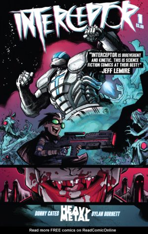
Issue #1
![]() A wild, refreshing, terrific concept from author Donny Cates that’s so outrageous that you hardly notice that most of this issue is told in exposition, or when that exposition suddenly switches to present day action. Cates has created an audacious blend of vampire horror and intergalactic sci-fi that hits even harder due to its plain, almost story-book illustration from Dylan Burnett.
A wild, refreshing, terrific concept from author Donny Cates that’s so outrageous that you hardly notice that most of this issue is told in exposition, or when that exposition suddenly switches to present day action. Cates has created an audacious blend of vampire horror and intergalactic sci-fi that hits even harder due to its plain, almost story-book illustration from Dylan Burnett.
Issue #2
![]() This is even more tonally jarring than the first issue, going the way of brutal, bloody comedy as young Earth survivor Weep (who is more than meets the eye) and the woman in the Interceptor suit escape a vampire prison with the help of Weep’s father.
This is even more tonally jarring than the first issue, going the way of brutal, bloody comedy as young Earth survivor Weep (who is more than meets the eye) and the woman in the Interceptor suit escape a vampire prison with the help of Weep’s father.
This is much lower on world-building than the expansive first issue, but that’s because we no longer have a bird’s eye view on Earth from another planet. It still gives us some useful hints about vampire society (and their terrible music), and ends with the focus on the suddenly abandoned Interceptor suit.
Issue #3
![]() The tone of the book settles down as we get a frank conversation about the bleak future of Earth and its remaining humans. The only chance to shatter their trajectory towards extinction is to usurp the North American Vampire Queen and her dreams of a space race. This issue is very rewarding, as it not only fills in some more world building, but also brings us a vampire ally (we always love those!) and gets Poli back into her badass Interceptor suit!
The tone of the book settles down as we get a frank conversation about the bleak future of Earth and its remaining humans. The only chance to shatter their trajectory towards extinction is to usurp the North American Vampire Queen and her dreams of a space race. This issue is very rewarding, as it not only fills in some more world building, but also brings us a vampire ally (we always love those!) and gets Poli back into her badass Interceptor suit!
Issue #4
![]() I don’t always love “structure” issues – that is to say, issues that are constructed around a single scripting device or artistic choice, rather than a narrative one. This issue’s conceit is to play out all of the major anti-vampire carnage of the Interceptor suit’s tear through the city against Poli’s monologue before the mission, recorded and sent back to the President on Pallus.
I don’t always love “structure” issues – that is to say, issues that are constructed around a single scripting device or artistic choice, rather than a narrative one. This issue’s conceit is to play out all of the major anti-vampire carnage of the Interceptor suit’s tear through the city against Poli’s monologue before the mission, recorded and sent back to the President on Pallus.
At point it tracks nicely to the action, but at others it distracts from it. Especially when Poli starts going head-to-head against the vampire queen and she has dialog, it feels like it was time for the device to have ended. Still, this wraps up with a nice little bit of intrigue that turns the book on its head a bit, and it definitely makes me want to read the next one.
The artwork? Eh, not my favorite in the series so far. Drawing so many scores of vampires seems to have really loosened the art quality, which in turn makes some of the 1:1 confrontation at the end a little less satisfying (though, I did really love the color work of blood read against the darkened halls of the queen’s throne room)
Issue #5
![]() An action-soaked finale that starts with some confusion (but carries three big surprises in it as we have a final showdown, a cut a few months down the road, and finally a brief visit back to the planet Pallus, which the last issue lacked. Donny Cates and company truly nailed the landing with this one, delivering a single satisfying story in a vastly interesting sci-fi horror world. I’m eager to read the next chapter in Reactor (the first issue of which I review below)!
An action-soaked finale that starts with some confusion (but carries three big surprises in it as we have a final showdown, a cut a few months down the road, and finally a brief visit back to the planet Pallus, which the last issue lacked. Donny Cates and company truly nailed the landing with this one, delivering a single satisfying story in a vastly interesting sci-fi horror world. I’m eager to read the next chapter in Reactor (the first issue of which I review below)!![]()
Justice League (2016) #22-24, DC Comics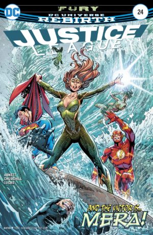
Issue #22
![]() A fun distraction of an issue from writer Shea Fontana (of DC Super Hero Girls) and Phil Briones on some very Alan Davis-esque artwork. This story holds together well and makes good use of the team (plus a fun appearance from Superman’s son Jon), although the resolution of the plot about space bugs is somewhat rushed and disconnected from itself. Lois researches the bugs, but it doesn’t pay off. Jessica has one burrow into her neck, but later it’s just harmlessly in her hand.
A fun distraction of an issue from writer Shea Fontana (of DC Super Hero Girls) and Phil Briones on some very Alan Davis-esque artwork. This story holds together well and makes good use of the team (plus a fun appearance from Superman’s son Jon), although the resolution of the plot about space bugs is somewhat rushed and disconnected from itself. Lois researches the bugs, but it doesn’t pay off. Jessica has one burrow into her neck, but later it’s just harmlessly in her hand.
Even if it doesn’t make total sense, it was a fun read and a nice break from the heavier Hitch issues without actually breaking from his theme of a world constantly under threat.
Issue #23
![]() Another one-off issue, this time from writer Tom DeFalco. It’s a nice (if simplistic) moment of the JL doing some counter-terrorism with a focus on Batman, Wonder Woman, and Jessica Cruz. It feels like a very average sort of 90s comic that wears its themes on its sleeve and works for all ages.
Another one-off issue, this time from writer Tom DeFalco. It’s a nice (if simplistic) moment of the JL doing some counter-terrorism with a focus on Batman, Wonder Woman, and Jessica Cruz. It feels like a very average sort of 90s comic that wears its themes on its sleeve and works for all ages.
In the present day, that actually makes it seem pretty great. I suppose that’s what you get from a DeFalco fill-in.
Issue #24
![]() This Dan Abnett penned issue feels like a B-side of his concurrent Aquaman run … and that’s fine. In that run, Aquaman is caught up both literally and physically by the politics of Atlantis, leaving Mera alone in the surface world.
This Dan Abnett penned issue feels like a B-side of his concurrent Aquaman run … and that’s fine. In that run, Aquaman is caught up both literally and physically by the politics of Atlantis, leaving Mera alone in the surface world.
The fact that Mera had no relationship with the League up to this point is somewhat surprising, but equally surprising is that she’s simply not as repetitive as Aquaman on the team. Her powers make her not at all repetitive of Wonder Woman as Aquaman typically is, and no one else on this all-classics squad has her fiery temperament or alien perspective.
This is a fun issue, and it’s particularly good-looking thanks to line art from Ian Churchill.
![]()
Lady Mechanika (2010) #0-2, Benitez Productions
 Issue #0
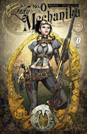
![]() A pitch-perfect introduction. This is everything zero issues ought to be – a one-off adventure that sketches our world in a way that could be skipped but lends depth to further stories. It doesn’t give us all that much about Lady Mechanika, her history, or her abilities, and that’s fine! It does its job of looking gorgeous and pulling us forward to read the full series.
A pitch-perfect introduction. This is everything zero issues ought to be – a one-off adventure that sketches our world in a way that could be skipped but lends depth to further stories. It doesn’t give us all that much about Lady Mechanika, her history, or her abilities, and that’s fine! It does its job of looking gorgeous and pulling us forward to read the full series.
Issue #1
![]() This debut issue introduces mystery for Mechanika to investigate that is also the mystery of herself. Another mechanical woman dies after having seemingly fled her captors. She is not constructed in the same fashion as Mechanika, but their few similarities lead our heroine to question her own murky origin.
This debut issue introduces mystery for Mechanika to investigate that is also the mystery of herself. Another mechanical woman dies after having seemingly fled her captors. She is not constructed in the same fashion as Mechanika, but their few similarities lead our heroine to question her own murky origin.
This is finely grounded in the #0 issue at a couple of points, but works fine without it as well. Wonderful art throughout, and I feel like the letters opened up their kerning a hair to be a bit more readable than in the preview.
Issue #2
![]() This issue has a certain newborn foal clumsiness to it and a lot of script. Some of the pages are covered more in word balloons than images!
This issue has a certain newborn foal clumsiness to it and a lot of script. Some of the pages are covered more in word balloons than images!
It felt like someone who has been waiting to tell their cool story for so long finally had the chance and went a bit overboard. Like, maybe there should have been more room for entire panels of prose-like dialog rather than obscuring so much of the beautiful artwork? Also, I’m not sure we needed quite so much exposition on the fearsome engineer, Mr. Cain.
Even if it was overly-wordy, I still adored this issue. I’ll definitely be reading more!![]()
Maxwell’s Demons (2017) #1, Vault Comics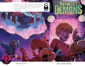
![]() Some Vault Comics start with a first issue so completely formed that it feels like its own graphic novel that doesn’t require any further issues.
Some Vault Comics start with a first issue so completely formed that it feels like its own graphic novel that doesn’t require any further issues.
That was the case with Zojaqan earlier in 2017, and it’s also the case in this equally gorgeous first issue. Maybe it’s a defense against Vault’s slow shipping schedule, or maybe it’s just a philosophy – that stories should all stand on their own. This is yet another gorgeous book from Vault.
Maxwell’s Demons is a smart sci-fi update on the themes of Calvin and Hobbes. Here, a hyper-intelligent young boy’s imagination does more than animate just one of his favorite toys. Maxwell and his entire menagerie of playthings discover a powerful inner universe that connects him to the very fabric of matter.
It seems that this universe is literal, and in conquering it Maxwell has become something more than a 10yr old boy. But, what will he do with that knowledge? ![]()
Morea, Vol. 1, Delcourt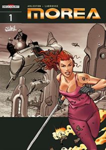
![]() An intriguing story that’s similar to the concept of Maestros from last week. An entire ruling family of a major corporation is murdered, leaving one lowly trainee as the only living heir. She inherits not only a company and a fortune, but becomes a sort of world-defending superhero – a force of pure good.
An intriguing story that’s similar to the concept of Maestros from last week. An entire ruling family of a major corporation is murdered, leaving one lowly trainee as the only living heir. She inherits not only a company and a fortune, but becomes a sort of world-defending superhero – a force of pure good.
I was completely on board for this concept fronted by a powerful woman, but I found the execution a bit dull. The European graphic album is little too concerned with delivering minor bursts of exposed breasts, which was borderline-creepy for me since it’s drawn in the “teens with big heads” all-ages Ultimate Spider-Man style of Mark Bagley.![]()
Mystik U (2018), #1, DC Comics
![]() This is a decent piece of “Harry Potter Starring The DC Magic Users” fan-fiction. It’s incredibly accessible for new readers with consistent art and charming characters, so I think it accomplished all of its goals (though I’m not a fan of the overly-bold lettering).
This is a decent piece of “Harry Potter Starring The DC Magic Users” fan-fiction. It’s incredibly accessible for new readers with consistent art and charming characters, so I think it accomplished all of its goals (though I’m not a fan of the overly-bold lettering).
The most interesting part is the future hook that begins the issue – one that might actually be in another realm of continuity. It builds in a mystery of which student might betray the others. That said, as a more experienced reader, I just cannot get past the magician mix-and-match of this plot quite yet. It felt like it was cutely relying on some of our existing knowledge of some characters (which isn’t playing very fair!) while hoping we’d forget our baggage for others.
![]()
The Realm (2017) #1-4, Image Comics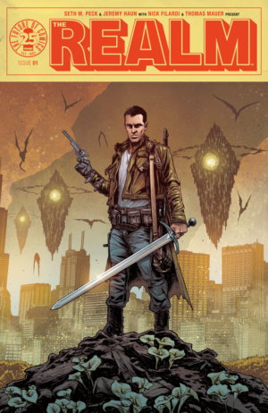
Issue #1
![]() A wonderfully wicked start to this series shows us the viciousness of this fanciful post-apocalyptic version of the United States, which has shades of Dungeons and Dragons and Jonathan Hickman’s East of West. This gives us a sense of the characters, and a hint of the larger conflict. I really love the art, but the shaky qualities of the letter balloons and the lettering started to grate a bit by the end of the issue.
A wonderfully wicked start to this series shows us the viciousness of this fanciful post-apocalyptic version of the United States, which has shades of Dungeons and Dragons and Jonathan Hickman’s East of West. This gives us a sense of the characters, and a hint of the larger conflict. I really love the art, but the shaky qualities of the letter balloons and the lettering started to grate a bit by the end of the issue.
Issue #2
![]() It seems there are four major factions in this world and they’re already getting close to bumping up against each other. There’s the traveling group, with its scientists ferrying something remarkable. Eldritch has some evil aims, and is massacring whole towns as he communes with spirits. Then, there is the Orc Killer versus the orcs, both of whom are playing on the fringes of those main two narratives.
It seems there are four major factions in this world and they’re already getting close to bumping up against each other. There’s the traveling group, with its scientists ferrying something remarkable. Eldritch has some evil aims, and is massacring whole towns as he communes with spirits. Then, there is the Orc Killer versus the orcs, both of whom are playing on the fringes of those main two narratives.
I love that this peculiar world isn’t too defined past these characters. We have no explanation of why the American map is dotted with fantasy creatures, and I don’t want one. Knowing that that each factions have their goals, however broad, is enough to keep this book moving.
The art is fantastic. The marriage of the linework and the colors is tight, which really showed in the scenes of carnage and different lighting looks in this issue.
Issue #3
![]() Part of me wanted to like this issue a little less, because it had a few scenes that were hard to understand even after a careful read (which was at least in part down to art choices). Yet, the voicing on our primary cast is so strong, and there was a fair amount of action in this issue even outside of the two hard-to-understand scenes. I think that still makes this pretty great, and the artwork was somehow even better in this issue than in the first two!
Part of me wanted to like this issue a little less, because it had a few scenes that were hard to understand even after a careful read (which was at least in part down to art choices). Yet, the voicing on our primary cast is so strong, and there was a fair amount of action in this issue even outside of the two hard-to-understand scenes. I think that still makes this pretty great, and the artwork was somehow even better in this issue than in the first two!
Issue #4
![]() This is like The Walking Dead but compressed to move briskly. Our little party makes it to an encampment, but everyone is having some sort of problem – the young characters are seeing things, the scientists are getting nervous, and our protagonist is having problems with his weird inorganic arm. Plus, the orcs are right on their tails (maybe summoned by someone in their midst)?
This is like The Walking Dead but compressed to move briskly. Our little party makes it to an encampment, but everyone is having some sort of problem – the young characters are seeing things, the scientists are getting nervous, and our protagonist is having problems with his weird inorganic arm. Plus, the orcs are right on their tails (maybe summoned by someone in their midst)?
I’m not usually into comics that rely heavily on the implied coolness of their environment without explaining much of their world, but this is just so well-done largely through it’s increasingly large cast of compelling characters.![]()
Paper Girls (2015), Vol. 3 (#11-15), Image Comics
![]() The continuing theme of Paper Girls seems to be that every arc will be a totally different kind of comic set in a different time period.
The continuing theme of Paper Girls seems to be that every arc will be a totally different kind of comic set in a different time period.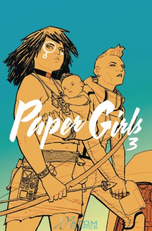
Those periods exist as a narrative in three different orders – the objective order in which they occur on the timeline, the order in which our four protagonists experience them, and the order in which they’re being witnessed from a much later point in the time stream.
The problem is that our protagonists are experiencing them in a seemingly random progression, in the style of Sliders or Quantum Leap – or, in the comics realm, Exiles. That’s a cool concept when your time-jumpers are a team of capable adults, but watching four totally normal tweens somehow survive each successive leap goes beyond stretching the boundaries of my suspended disbelief to just be boring.
This time around we get a middling prehistoric adventure comic. We finally have a sense of who these girls are as unique characters, and that makes their action with each other a little more compelling in this arc without an adult character to instill some gravity into the situation.
We get some personal growth here from Mac and KJ, and it makes KJ less of a cipher it makes Mac even more annoying and hard to like (both as a character and also as an element of the story).
The war through time is infinitely more interesting then these characters because all of the characters with intelligence and agency exist outside of time. The B-plot here follows one of those characters. She is another visitor to the prehistoric past who thinks she is the first time traveller … except, in addition to running into our protagonists, there are already hints in the past that they have some knowledge of the future, like a cave man with a “Power” symbol painted on his chest.
Again, inserting an adult into the situation who can dispense information and rational sense makes this comic stronger. So much of this book is driven by uninformed decisions and random happenstance. It’s never a good sign when a book ends with characters doing something that could lead to their death and I think, “Oh, good, maybe we’ll get newer, better characters after that!”![]()
Reactor (2017) #1, Vault Comics
![]() A rangey, imaginative, post-apocalytpic future where humans escaped to space after humans overran the Earth, but now a small crew is back to liberate it.
A rangey, imaginative, post-apocalytpic future where humans escaped to space after humans overran the Earth, but now a small crew is back to liberate it.
I actually read this before I realized it was a continuation of Interceptor. Even without that critical background I enjoyed the cheeky and quick-moving script from Donny Cates. Sometimes it has moments of rushing forward quickly that took a bit of getting used too, but that’s explained by the fact that readers were expected to know most of this stuff already!
Of special note is a great set of colors from Dee Cunniff, which managed to be post-apocalyptic but still plenty saturated and colorful.![]()
Rose (2017), #1-4, Image Comics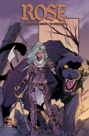
Issue #1
![]() Terrific, ultra-beautiful artwork on this one, though it’s a pretty stock-standard fantasy start. The magic has been hunted out of the world, and one chosen girl can bring it back.
Terrific, ultra-beautiful artwork on this one, though it’s a pretty stock-standard fantasy start. The magic has been hunted out of the world, and one chosen girl can bring it back.
There are a few nice flourishes, like a race of magical cat creatures and an evil queen with PTSD from a childhood of slavery. This series will get much more interesting when it ditches its tragic origin story and brings more of those elements to the fore.
Issue #2
![]() The artwork in this series is so darn beautiful, that it’s almost painful not to love it more. Meredith Finch’s writing is fine. At points even proficient. But, there’s a certain flatness to the dialog, a certain halting quality to the pacing.
The artwork in this series is so darn beautiful, that it’s almost painful not to love it more. Meredith Finch’s writing is fine. At points even proficient. But, there’s a certain flatness to the dialog, a certain halting quality to the pacing.
This issue is almost entirely Rose fleeing an attacker, being caught up with, and then being attacked by a fallen Guardian – which should be edge-of-your-seat suspense. She’s in peril the entire time! Yet, there’s not the visceral thrill that should come with each of those action-filled developments.
Issue #3
![]() There’s a certain dissonance here of Rose, who clearly knew she could wield subtle magic in scenes in the first issue, being so naive about her more overt magical abilities and the possibility of her being a Guardian. The brilliant artists are working from a particularly wooden script on this issue. The entire plot is run through with stumbling confusion, preventing any excitement to building from one scene to the next.
There’s a certain dissonance here of Rose, who clearly knew she could wield subtle magic in scenes in the first issue, being so naive about her more overt magical abilities and the possibility of her being a Guardian. The brilliant artists are working from a particularly wooden script on this issue. The entire plot is run through with stumbling confusion, preventing any excitement to building from one scene to the next.
Issue #4
![]() This story is as wooden as Pinocchio. It’s crazy that art this beautiful and expressive isn’t just dancing off the page, but the script has feet of clay. Rose has to escape from guards in a house, but it’s boring. She fights a knight in the forest, but it’s ho-hum. There’s no motion and rhythm to this book, despite its delightful concept and lovely artwork. After four flat issues in a row, it’s a drop for me.
This story is as wooden as Pinocchio. It’s crazy that art this beautiful and expressive isn’t just dancing off the page, but the script has feet of clay. Rose has to escape from guards in a house, but it’s boring. She fights a knight in the forest, but it’s ho-hum. There’s no motion and rhythm to this book, despite its delightful concept and lovely artwork. After four flat issues in a row, it’s a drop for me.![]()
Tarot: Witch of the Black Rose (2000) #1, BroadSword Comics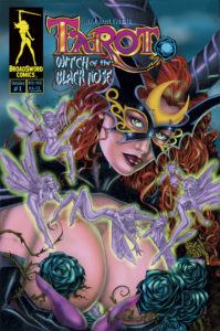
![]() I don’t… quite… know what to say.
I don’t… quite… know what to say.
This a mid-90s-style magic T&A comic. Creator Jim Balent (famous for a long run of Catwoman) is a great artist who is drawing a stylish (if dated) book here, except for the ridiculous breasts the size of watermelons (or larger!) on every female figure, whether they’re human or carved from stone.
If you can squint past the bosoms, the plot here has potential. An evil witch is out to remake the world in her image. Her sister, a good witch, relies on the predictive power of the tarot and some unspecified amount of magical mojo to stop her sister. Tarot partners with a vengeful graveyard defender to stop her sister and retrieve his lost coffin containing the bodies of a pair of conjoined twins.
I’m fine with an amount of ridiculously accentuated anatomy – after all, I did come to comics in the 90s – but at a point the plot takes a back seat to the titillation. Also, a lot of the captions here are vastly overwritten – weird, for an artist/writer, since you’d think he’d trust himself to just play out the scenes.
I think if you’re looking for a long-running T&A book in the vein of Lady Death that this might scratch the itch. I peeked at some issues much father along (this book is still going!), and it seems like it took a turn for the farcical and even more explicit, with the characters acting as wanton sex dolls. Which, if you dig that sort of thing – cool!![]()
Void Trip (2017) #1-2, Image Comics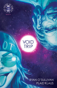
Issue #1
![]() A ludicrous blend of Hitchhikers Guide to the Galaxy and Fear and Loathing in Las Vegas, two of my favorite books of all time, with a side of Spaceballs.
A ludicrous blend of Hitchhikers Guide to the Galaxy and Fear and Loathing in Las Vegas, two of my favorite books of all time, with a side of Spaceballs.
I feel like we got two very compelling and fully formed characters and we know enough about their dispositions to understand why they might be adventuring together towards the same goal without needing the entire universe to be defined. The artwork is strong and really sells the humor in the script, and the lettering is wonderfully plain and easy to read with unlined balloons that leave the pages feeling uncluttered.
Also, now I want to eat some fruit.
Issue #2
![]() This issue is even more twisted than the first, which is a bit disorienting but still pretty strong. The artwork is incredibly, delightfully good, and the bad robot has a definitely Grant Morrison, fourth wall breaking quality to him.
This issue is even more twisted than the first, which is a bit disorienting but still pretty strong. The artwork is incredibly, delightfully good, and the bad robot has a definitely Grant Morrison, fourth wall breaking quality to him.![]()
Warframe (2017) #1, Image – Top Cow
![]() A comic based on some manner of game? I am an Old and have no idea about these things. One time I bought a comic called The Witcher thinking it was a Hellboy book only to find out it was about a video game!
A comic based on some manner of game? I am an Old and have no idea about these things. One time I bought a comic called The Witcher thinking it was a Hellboy book only to find out it was about a video game!
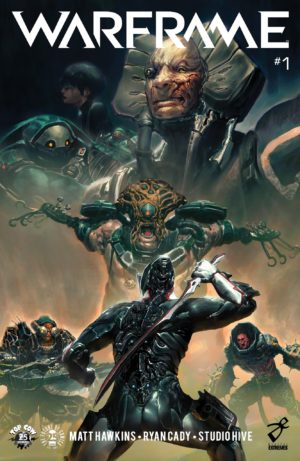
The story is a basic one dressed with lot of hard sci-fi trappings. There’s something to find on this planet. A race of relentless conquerors will kill everything to get it, including razing entire villages of innocent people. Only a single one of a ROM-like race of semi-sentient armored knights (“Tenno”) can defend the planet from their onslaught … but it’s put out the call for some friends.
The art inside of this book is stellar – from massive battles under the glint of moonlight to misty, rain-tinged wreckage in the aftermath. I checked out screenshots from the game, and I’d say the comic looks even better – like heavily rendered concept art imbued with motion as it tells a sequential story.
While the lettering styling from Troy Peteri was pretty cool, the actual readability of the lettering wasn’t always great. It’s a lot of white on black and white on transparent gray.
As a non-gamer I get a little disheartened that I’m reading what is only a tertiary story in a universe rather than a primary one which I’ll be able to access. Anyone who plays the game would have come into this with a lot more context than I had. I felt like I was squinting at something they could probably see very clearly.
I’m willing to bet that anyone who has played this game is going to be head-over-heels in love with this book. Without the additional background of the game I don’t know that I’m especially eager to read more.