Welcome to our second pilot post of Back Issue Review, where I give you the run-down on all the not-new comics I read this week. (Did you miss last week’s edition?)
I know the knee-jerk reaction for a lot of readers to a post like this might be to say either “I don’t read comics” or “I’ll just tune in when you talk X-Men.”
My reply to you is that comics as a medium is so much more than what you’re seeing on the big screen or in the pages of X-Men books.
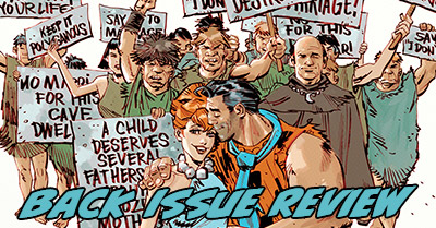
I’d love to connect you with a new favorite read, but also with a wider awareness of the medium.
Today’s back issue review includes write-ups on:
- After Eden (2017) #1-4
- Captain Canuck (2015) #3
- Centipede (2017) #1
- Cowboy Ninja Viking (2009) #1
- Eugenic (2017) #1-3
- The Flintstones (2016) #1-6
- Green Arrow (2016) #10-11
- Green Lantern Corps (2006) #1-3
- Grimm Fairy Tales: Return to Wonderland (2007) #4-6
- Jonesy (2016) #1, Scalped (2007) #1
- Space Battle Lunchtime (2016) #1-8
- X’ed (2015) #1-4
That’s a lot of indie comics and absolutely no Marvel!
Please let me know if you like this this post – it’s the second pilot of this new weekly series, but there’s no guarantee it will be back for more.
And now – let’s get to the comics!
![]()
After Eden (2017) #1-4, Red 5 Comics
![]() Written by Scott Chitwood with line art by Roderick Thornton and color art Garry Henderson. Letters by Troy Peteri. Covers by Matthew Warlick.
Written by Scott Chitwood with line art by Roderick Thornton and color art Garry Henderson. Letters by Troy Peteri. Covers by Matthew Warlick.
A tight, well-made small press comic that tales a novel approach to retelling the post-Garden of Eden story. Granted, I am a sucker for well-done Biblical fiction with a slight dark or comedic edge, but this had magic beyond its weirdly-specific fit for one of my favorite genres (see also Steven Brust’s To Reign In Hell).
Since we already know the story of Adam and Eve pretty well, the plot beats in this book can’t really be the biggest selling point. They don’t have to be… the art is beautiful. Not just enjoyable, but “stop and stare multiple times per issue to appreciate it” gorgeous.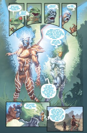
Roderick Thornton‘s line work looks to me as if it is largely pencils only with colors from Garry Henderson directly on top of pencil shading. This allows for dark, textured fills on things like hair and tree bark that still has color on top of it, rather than the stark black-and-white world of inked work. I found myself stopping so many times to appreciate the execution of the colors and appreciate how great uninked pencils can look under colors. The character designs of the angels and devils are can’t-look-away great.
Of course, there has to be a little more than art to a book. How does Scott Chitwood deal with the Adam and Eve story? He starts with their resentment each other as they are cast out of the garden, focusing on Adam’s headstrong nature and Eve’s open-eyed wonder at the world. The two of them can’t seem to work together at first, but once they are separate they realize how much they appreciate seeing the reflection of this new world in the other.
This isn’t just the first love story. Adam and Eve have no idea how to navigate a dangerous world. They don’t even know what to eat! A pair of angels watches over them and guides them by appearing as a series of animals, but they’re faced with a pair of Lucifer’s demons intent on corrupting or killing the humans at every turn.
It ends in a bit of a manic angel fight – something I’m not actually against in the slightest, but it takes away a bit from the survivalist drama of Adam and Eve. They’re standing around being a bit helpless while there is a holy war invisible in the air all around them. Thematically that actually works really well, as in they end they take their own agency and save themselves for the first time without the angels!
After Eden is a strong book, all-around – I wouldn’t have been surprised at all to see an Image logo on it (not that they’re the ultimate arbiter of quality). I don’t know that every comic fan would enjoy it, but anyone who loves Biblical fiction like I do will appreciate it.
![]()
Captain Canuck (2015) #3, Chapterhouse Comics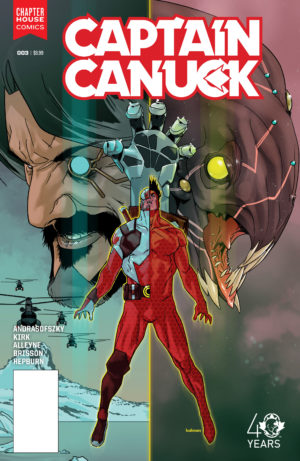
![]() Written by Kalman Andrasofszky with line art by Leonard Kirk, colors by Paris Alleyne, and letters by Ed Brisson. Cover by Kalman Andrasofszky.
Written by Kalman Andrasofszky with line art by Leonard Kirk, colors by Paris Alleyne, and letters by Ed Brisson. Cover by Kalman Andrasofszky.
(Note: I have not been reading the Captain Canuck Classic backups; this rating only reflects the main story.)
We get a big slice of origin story of Captain Canuck, his brother, and Olivia AKA Redcoat. I find that I’m really starting to care about these characters and I just want more of them all!
Leonard Kirk’s art here isn’t quite as strong as I’m familiar with it being at Marvel, maybe owing to him inking himself or maybe because this is a side gig for him. It’s a bit loose, especially on facial features. No matter, it’s still plenty attractive, especially with bold colors (and some fun patterned fills) from Paris Alleyne.
I’m not sure that I’m ready to recommend this yet, as I’d like to see if the quality keeps up for the entire first arc, but so far it’s been a really enjoyable comic with the implied scope of a shared universe much wider than just itself.
![]()
Centipede (2017) #1, Dynamite Entertainment
![]() Written by Max Bemis with line art by Eoin Marron and color art by Chris O’Halloran. Letters by Taylor Esposito. Cover by Francesco Francavilla.
Written by Max Bemis with line art by Eoin Marron and color art by Chris O’Halloran. Letters by Taylor Esposito. Cover by Francesco Francavilla.
This reimagining of the classic Atari game (yes, really) is proficient, but not great for me. That said, I can see a certain kind of reader who would really love this book.
The entire issue follows a single, seemingly random survivor of a planet-wide disaster as he monologues about being the only man left alive – first to a static-filled radio band, and then directly to the reader. On a planet that depends on conformity and cooperation to drive its society, he spent his life hoovering up Earth fiction – rendering him seemingly useless. Will his fluency with the Hero’s Journey keep him alive through the onslaught of the deadly centipede and its many bloodthirsty kin and symbiotes?
I found the issue to be trifling. Maybe I just didn’t want so much story about a single human being to introduce me to the world of Centipede (and, he wasn’t a human I was excited to spend a lot of time with). Maybe it’s coming off of Flintstones to read this (more on that, below).
Either way, it isn’t a bad comic – just not for me. I think this appeals to a certain taste – a reader who like survivalism, deconstructionist meta-fiction, and dark humor. I could see a fan of Rick Remender’s Fear Agent really appreciating it. It simply didn’t land for me.
![]()
Cowboy Ninja Viking (2009) #1, Image – Shadowline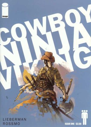
![]() Written by A J Lieberman with art by Riley Rossmo. Letters by Clayton Cowles. Cover by Rossmo with Dave Casey.
Written by A J Lieberman with art by Riley Rossmo. Letters by Clayton Cowles. Cover by Rossmo with Dave Casey.
I read this on a dare from The OmniDog after he interviewed me last week!
When I ask for innovative stories full of hairpin turns I am asking for this sort of a thing. A shadowy company is trying to keep tabs on its global killing machines, each a multiple-personality blend of a trio of influences, and non deadlier than the Cowboy Ninja Viking!
I found this concept very fun and I liked that we experienced it mostly through the narrative of a “normal” agent, as the schizophrenic scenes with Mister Cowboy Ninja Viking could be a bit too scatter-shot for me.
Yet, ultimately what might keep from coming back to this book is artist Riley Rossmo’s coloring choices. He’s using a slightly messy, ink-lined approach on art with a single spot color for highlighting – here, it’s a light blue, but it changes in future issues.
For me, the single-color highlight actually made it harder for me to concentrate on the rest of the artwork. I didn’t really understand how or why Rossmo was choosing to use the color – sometimes for shadow, sometimes for lighting effects, others just for emphasize. It was distracting, and didn’t marry well to the wide cast of characters and plot intrigue.
That could just be a “me” thing. Looking past the art style, this book has great scene setting and concept, and I fully understand its madcap appeal. I just don’t think I have the focus to squint through another nine issues.
![]()
Eugenic (2017) #1-3, Boom! Studios
![]() Written by James Tynion IV with art by Eryk Donovan. Letters by Dee Cunniffe.
Written by James Tynion IV with art by Eryk Donovan. Letters by Dee Cunniffe.
Writer James Tynion IV has been slaying me on Detective Comics for the past year in a half, which lit a fire under me to check out more of his creator-owned work, including his “ic” trilogy of three-issues standalone series.
I voraciously tore through Memetic (2014) and Cognetic (2015), two separate tales about viral change that could end the world as we know it. Memetic hit me like a five-star gut punch, like Infinite Jest less its whole cast of characters and boiled down to a tragic love story. Cognetic was also great (and maybe the stronger concept of the times), a kaiju horror story stretching back to prehistoric times where the only monster is us.
Eugenic simply doesn’t stand up to those prior works in execution, though its concept is brilliant – what if only one scientific mind held the cure for a debilitating disease, and what if that mind had other plans for the future of the human race?
This necessarily requires a longer arc through time than the prior two mini-series to see its results. That’s what makes this dark instead of just gripping – humanity ends in both the prior series, and we see its decline in nearly real time. Here it continues, both better and worse than ever before, but lacking for a central protagonist for us to pin our hopes.
There was a lot of compelling content here – some of the darkest and most challenging of the trilogy, and perhaps the truest when it comes to the darker side of human nature. However, on the whole it comes off as a sort of shocking-but-static philosophy lesson robbed of narrative of impact. It’s the weakest chapter of this trilogy of trilogies.
![]()
The Flintstones (2016) #1-6, DC (Licensed)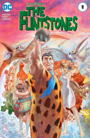
![]() Written by Mark Russell with line art by Steve Pugh, colors by Chris Chuckry, and letters by Dave Sharpe.
Written by Mark Russell with line art by Steve Pugh, colors by Chris Chuckry, and letters by Dave Sharpe.
It took me reading at least five reviews of this book to realize that people were series when they said it was one of the best comics of 2016, and even then it took me an entire year to sample it.
So, please allow me to be one of many voices to insist to you that: you must read this comic book. I don’t know how this comic manages to be this good. It might involve sorcery.
This is the same Flintstones family you recall from the cartoons of your youth, but with a new layer of both realism and hilarious, biting social commentary layered into every typical Flintstones gag. Seriously, each issue plays like an actual episode.
If I had to compare this to anything, I’d maybe pick my current TV obsession The Good Place, which is rife with deeper philosophical questions beneath its absurdist slapstick. The Flintstones highlight themes of consumerism, war and PTSD, pseudo-science, the meaning of art, religion, marriage, democracy, and more in this run.
As great as Mark Russell’s scripts are for every issue, I often nearly forgot that words were on the page as I beheld the beauty of Steve Pugh drawing retro cartoon art like the fate of the world depends on it with vivid colors from Chris Chuckry.
Only once does this get so mired in a central theme that the gags begin to stall (in the marriage issue). Otherwise, this nothing but is deliriously inventive comic-making.
![]()
Green Arrow (2016) #10-11, DC Comics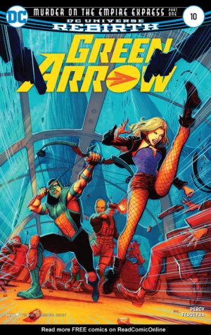
![]() Written by Benjamin Percy with artwork by Juan Ferreyra and letters by Nate Piekos.
Written by Benjamin Percy with artwork by Juan Ferreyra and letters by Nate Piekos.
Holy moly, Juan Ferreyra’s artwork!!!
Where does DC find all these self-coloring absolutely gorgeous artists? Are they all cartoon storyboarders stolen from movie houses and video games?
I don’t know, and I didn’t think anyone could top initial artist Otto Schmidt for me, but Juan Ferreyra left my jaw on the floor with his work on this two-issue arc.
Benjamin Percy continues to stun my on writing duties. His scripting of the ever-bickering Arrow/Canary/Diggle threesome in this story is a delight.
This death-on-a-train story somehow maintains the fantastical, high-budget adventure vibe of this book still while referencing Ollie’s past. The story is a bit of a cliche, yet it never comes off as a boring trope – if anything, it reinvigorates the tired “fighting on a speeding train” concept with a few brilliant set-ups that feel worth of a Mission Impossible film.
It’s an action movie on the page. It’s fast, but never feels rushed or confusing.
Truly just a wonderful comic book, and gorgeous through and through.
![]()
Green Lantern Corps (2006) #1-3, DC Comics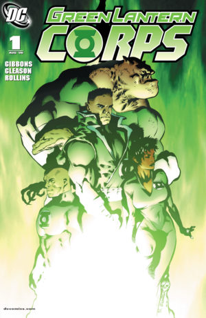
![]() Written by Dave Gibbons with pencils by Patrick Gleason. Inks by Prentis Rollins, Wayne Faucher, and Mick Gray. Colors by W. Moose Baumann. Letters by Phil Balsman and Nick J. Napolitano.
Written by Dave Gibbons with pencils by Patrick Gleason. Inks by Prentis Rollins, Wayne Faucher, and Mick Gray. Colors by W. Moose Baumann. Letters by Phil Balsman and Nick J. Napolitano.
I was very excited to return to Green Lantern Corps in my slow-but-sure read of Green Lantern’s modern saga, as their intergalactic assemblage of Jedi Space Cops appeals to me a lot more than an earthbound Green Lantern like Hal Jordan.
This first arc of their ongoing does not fail to please, picking up the threads of the last Green Lantern arc (with Guy Gardner just returning from exile due to his disobediance), but also of the Corps members we met in their Recharge mini.
The plot involves the murders of both royalty and Lanterns. It’s a solid mystery for less-than-enthusiastic Lantern Soranik Natu where several of the locals might not be all that they seem, and we still have time for a B-plot out in space. I thought the climax of the story wold go a super-obvious route, but Gibbon’s script double-crosses the readers to pull out several delicious, unexpected developments.
Patrick Gleason’s art along with W. Moose Baumann’s colors is staggering – it feels like a big budget sci-fi movie without ever getting ultra-realistic, because Gleason puts all of the details in the right places. It’s bold and unafraid to use bright colors and deep blacks, and has a pleasing dimensionality to it that I haven’t seen in Gleason’s newest work.
Between the action-filled story and stunning, near-flawless art from Gleason and the team, and this really feels like the most perfect Jedi Space Cops comic book I’ve ever read.
![]()
Grimm Fairy Tales: Return to Wonderland (2007), Zenescope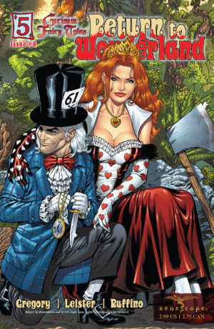
Written by Raven Gregory with Ralph Tedesco and Joe Tyler. Line art by Daniel William Leister with color art by Nei Ruffino. Letters by Alphabet Soup Studios.
Issue #4 ![]()
This issue is dominated by the Red Queen encounter in Wonderland. The vicious queen and her hapless card guards are rather well done, with simply tremendous lettering to indicate their suits and a vicious ending with the Chesire Cat that mercifully skips the croquet game.
If that was all, I’d say this was a good issue. However, we get a brief interlude in the real world that is simply ridiculous – dad has an affair while mom is in the house, son stows away in the other woman’s car and breaks her neck – none of it made sense, and just seemed to be there to make things more EXTREME (as if the Wonderland plot isn’t crazy enough!)
Issue #5 ![]()
I enjoyed this as much – or maybe more than – the stellar issue #2 last week.
I expected a lot of sex from Zenoscope, but also a twisted take on mythology that, like Fables, would recontextualize fairy tales for the real world. We’ve got that here, as well as progress on all fronts – surprising context for the brother’s behavior, a hint at how Wonderland works, the connection between mother and daughter, and the suggestion that Wonderland is just a insane face of something darker.
If Zenescope built a world where these sorts of dark mirror connections of fantasy were key, I’d keep reading despite all the T&A and extreme plot developments.
Issue #6 ![]()
I got the tiniest hint of something Lovecraftian from the last issue and I’m so delighted to see it pay off here, even if this is more of an epilogue than a proper issue. We’ve said goodbye to Wonderland as well to Callie’s father and brother, as she learns the truth from her grandfather and realizes he was complicit in her mother’s madness.
I’m not a big fan of “mythological evil caused World War II” plots, because it robs humanity of its own evil, which is real and cannot be written away. Yet, this idea that fairy tales are just the barely contained madness of the wrath of elder gods, and if they aren’t appeased that madness enters the world – that’s a strong concept.
I wasn’t a fan of Callie’s ending, but I have to admit that on the whole this series pushed Wonderland to places I never expected it would go and left me open to reading more Zenescope books in the future – not the outcome I expected!
 Jonesy (2016) #1, Boom! Entertainment, Inc.
![]() Written by Sam Humphries with line art by Caitlin Rose Boyle and color art by Mickey Quinn. Letters by Corey J Breen.
Written by Sam Humphries with line art by Caitlin Rose Boyle and color art by Mickey Quinn. Letters by Corey J Breen.
This is like those imitation Cartoon Network cartoons where all anyone does is scream and it’s all quick cuts and no context and one line jokes. Maybe I’m just the old dad who refuses to accept that the new music on the radio that’s cool with kids these days is any good, but I refuse to believe that this ranks as a comic that’s worth handing to a young reader.
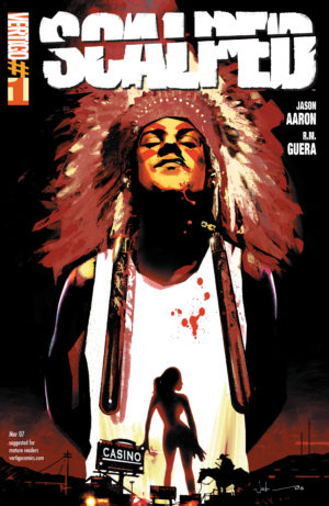 Scalped (2007) #1, DC (Vertigo)
![]() Written by Jason Aaron with line art by R.M. Guera, colors by Lee Loughridge, and letters by Phil Balsman. Cover by Jock.
Written by Jason Aaron with line art by R.M. Guera, colors by Lee Loughridge, and letters by Phil Balsman. Cover by Jock.
Oh goodness … this comic book is twenty shades of so not my thing, and if I squint past that I think it might actually be badly executed.
(Usually I know better than to pick up a Jason Aaron comic other than Thor, as I’ve long since established that I just don’t get wherever it is he’s coming from, but I was challenged by the founder of Omnibuds’ Cafe to check this series out.)
Look: Jason Aaron is great if you’re looking for hyper-masculine narratives full of blood and misogyny that reduce any interesting culture or story down to a series of precise dick measuring contests. I hear some people like that kind of thing and, if you do, I don’t begrudge you it at all!
From the last page reveal here, it seems like there’s a lot of depth yet to come to this story about the crooked kingpin of an Indian Reservation casino. The question is if it’s worth it to wade through all that toxic masculinity to appreciate the good story that might lie within.
Case and point: Do we need every female character to be viscously denigrated upon her first appearance to prove some kind of point? Misogyny is a character trait you can show us instead of tell us about repeatedly, and saying hateful things about women doesn’t take the place of actual characterization. What are we supposed to assume about a character who spits out vile things about every woman in sight, including his own daughter? Yes, he’s awful, but where’s the why there?
Sometimes the toxicity is the story itself, but that’s just too much suffering and hate for me to endure as a reader for the potential reward of a satisfying plot. It’s emblematic of where we stand as a culture that this sort of hatred is enough for us to say, “Wow, great characterization; so deep.”
(Also, my lack of connection with Aaron aside, the artwork (or maybe just the colors) were unparseable to me, with nigh-indistinguishable characters.)
I think there is probably an interesting story to be told here with this cast and setting, but not in the way Aaron has chosen to portray it.
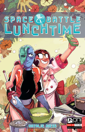 Space Battle Lunchtime (2016) #1-8, Oni Press
![]() Created by Natalie Riess.
Created by Natalie Riess.
A maniacal and adorable series that shows a lot of heart and even more pure imagination.
But, can it make baking interesting? You tell me: a Earthling pastry chef who gets whisked off to space to participate in the intergalactic version of The Great British Bake-Off crossed with Survivor (or, at points The Hunger Games).
This comic is a real all-ages charmer about, with aliens of every possible shape and size, plus a vast array of oddball cooking ingredients.
It’s a fast and sometimes indecipherable read. The lettering was repeatedly a real problem for me. It’s hand-lettered, and there were too many lopsized, wrong-sized, crowded shapes in the hand-lettering for me to make out many words. Also, in a world full of unfamiliar shapes, sometimes the busy-ness of the page combined with colors and lighting choices made the action a bit confused – especially in the first half of the series.
Despite being lightweight and sometimes messy, there is such a wealth of crazy ideas here that I couldn’t help but smile. The hilarity of a late-stage bloody kitchen arena and a beautiful zero-gravity cooking ballet show how much Riess’s art matures from the beginning of this series to the end. I would definitely read her next comic.
X’ed (2015) #1-4, Black Mask Studios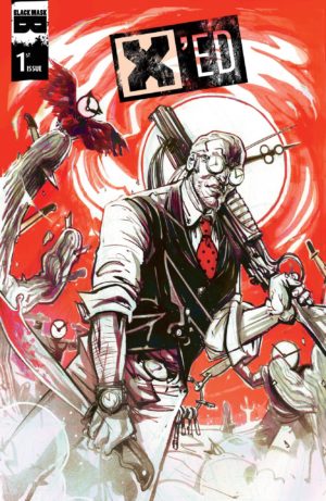
![]() Written by Tony Patrick with line art by Ayhan Hayrula and color art by Doug Garbark. Letters by Jim Campbell. Covers by Chris Visions.
Written by Tony Patrick with line art by Ayhan Hayrula and color art by Doug Garbark. Letters by Jim Campbell. Covers by Chris Visions.
This book is a mess with a terrific story buried in the middle of it – basically, the world of Inception done with more focus on therapy and fixing things than stealing things.
As someone who thinks Inception botched its terrific world-building to hyper-focus on its heist, I thought I was in for a treat here! Unfortunately, this book is trying to do too many things at once
Just as Inception had its three levels of dream state. There are three connected narratives in X’ed – the memories of an old, wealthy client; the mercenary in her mind (along with his own memories); and the real world drama playing out around their unconscious bodies.
Tony Patrick shows a lot more facility with action in the dreamland than with the real world, where scenes that are a confused tangle of motivations and consequences. The dream battles are terrific – just confusing enough, and full of made-up-on the spot dream logic, sudden turns of fortune, and deux ex machina that materialize from nowhere.
In short, it’s leveraging all the things wrong with the real world portion of the story, which is working too hard to unite a heist plot and a corporate take over.
I think a stronger editorial hand could have trimmed the fat and repeated themes in this story a bit to tighten it up (and avoided some unfortunate errors). Without that, it rumbling along uneasily towards a conclusion that never comes, as the final issue ends with a cliffhanger.
I am loving this feature! It really lets me know about books I should check out outside of Marvel, which is always useful. Plus I appreciate your negative reviews too, they’re never mean but insightful.