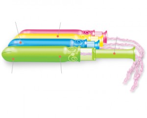
“Oh, because I’m always looking for neon colored things to put in my vagina.”

Seriously, if I was a woman I don’t think I’d be cruising the feminine products aisle looking for a box of tampons that resembles a pack of highlighters. I get the packaging of a tampon being a fun color so it’s unobtrusive in your purse, but the actual applicator? Are we seriously selling this to young women?
Can anyone with a vagina offer some insight?
(Because all tampons are “Tampax” to me, I had to use the interwebs to figure out the brand I encountered, and I must say that the Kotex “How to Insert a Tampon” video is refreshingly frank and personal for something coming from a major brand.)
The color of the applicator doesn’t matter. It’s the comfort. As a woman who initially picked a particular tampon and stuck with it for years (I went to a more eco-friendly monthly solution), I’d imagine Kotex is trying to “hook them” early – I’m sure these appeal to teen girls.
well, you know… this is exactly what i’m looking for when it comes to feminine protection ;)
I personally think their ads are really effective. I don’t know if maybe it is because I loved Lisa Frank as a kid, or maybe I hate white that much but this actually does NOT bother me. Perhaps the idea is to make them look like party favors rather than a sterilized hospital supply? That actually is surprisingly appealing to me as a marketing ploy. When you think about the taboos, the coddling, and the “shaming” that go into menstrual education these days this approach is not nearly as offensive to me as the commercials other brands air for the same product. This brand’s advertising debunks the typical “feminine product” commercial’s campaign showing women in white pants salsa dancing or trying to “defeat mother nature’s nasty curse”. I’d rather have a neon product advertised to me than a company that thinks blue liquid is a good representative of all bodily fluids.